What is a Gradient and What Types Exist

A gradient is a smooth transition from one color to another. Gradients are widely used in web design, graphics, applications, and art to add depth, volume, and dynamism. In this article, we'll discuss the different types of gradients, how they work, and where they can be applied, as well as provide practical tips for using them.
Main Types of Gradients
Linear Gradient

A linear gradient is the most common type of gradient. The color transition occurs along a straight line, which can be horizontal, vertical, diagonal, or in any other direction.
Easily create linear gradients with our generator or choose from the gradient library.
Example CSS:
background: linear-gradient(to right, #ff7e5f, #feb47b);
Complex CSS Example:
background: linear-gradient(135deg, #ff7e5f 25%, #feb47b 50%, #76b852 75%);
Linear gradients are often used to create backgrounds on websites, improve text readability over images, highlight buttons, and in posters and banners.
Radial Gradient

A radial gradient is a transition that starts at a point and expands outward to the edges. A radial gradient doesn't necessarily have to be circular — by default, it can be an ellipse that fills the entire area of an element.
Example CSS:
background: radial-gradient(circle, #ff7e5f, #feb47b);
Complex CSS Example:
background: radial-gradient(circle at center, #ff7e5f, #feb47b, #76b852);
Radial gradients are often used to create focus in the center of an element, such as in logos and icons, to highlight the central object.
Conic (Angular) Gradient

A conic gradient is a smooth transition of colors around a central point in a circle, creating a "cone" effect.
Example CSS:
background: conic-gradient(from 0deg, #ff7e5f, #feb47b);
Complex CSS Example:
background: conic-gradient(from 45deg, #ff7e5f, #feb47b, #57cc95, #8227ff, #ff7e5f);
Conic gradients are used to create charts, speedometers, or circular indicators, where the transition follows a clockwise or counterclockwise direction.
Mesh Gradient
.png)
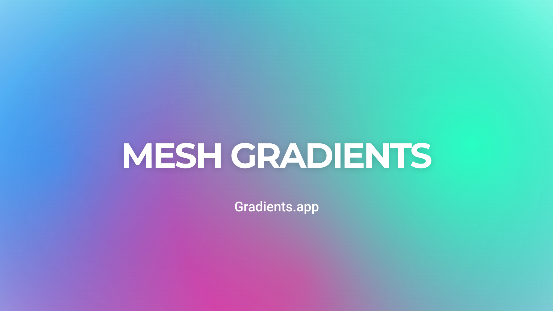
A mesh gradient is a complex mixture of colors created by overlaying multiple color points. Each point influences the area around it, creating smooth, multi-layered transitions similar to natural color changes.
To create mesh gradients, you can use our mesh gradient generator or other tools like Adobe Illustrator or Figma.
Mesh gradients are often used in digital art and illustrations to create realistic textures, light, and shadow transitions, adding a sense of depth and layering.
Practical Tips for Using Gradients
- Print Materials: In print, avoid using solid colors as a background. It's better to use a subtle gradient with slight color variations — such a background is more pleasing to the eye, creating depth and texture.
- Simplicity: Avoid using too many colors in a gradient — usually, two or three are enough to create a harmonious effect. Overly complex gradients can reduce readability and degrade user experience.
- Combining with Text: If a gradient is used as a background for text, make sure the text is easily readable. You can use shadows to improve contrast or choose gradients with soft transitions.
- Contrast and Highlights: Gradients are great for highlighting buttons or headers as they draw attention.
- Experiment with Direction: Try changing the angle and direction of the gradient to find the ideal balance. Linear gradients can be used vertically or diagonally, creating different visual effects.
- Gradients in CSS: For web developers, it's useful to know how to create gradients with CSS. For example, a linear gradient can be created as follows: background: linear-gradient(to right, #ff7e5f, #feb47b); This creates a smooth transition from orange to pink from left to right.
Examples of Gradient Usage
Gradients are widely used as backgrounds for blocks, button backgrounds, or text, adding depth and appeal to elements.
Background
The most popular way to use a gradient is as a background. It’s essential to choose colors that set the right mood and provide enough contrast to highlight other design elements. The gradient can cover the entire page or highlight specific areas, acting as a focal point for key elements.
Buttons and Other Interface Elements
Gradients are applied to buttons, block borders, icons, and menus to create a pressed effect, highlight, or accentuate. They can serve as a background or be directly applied to elements, making them stand out more.
Text
Gradients are used less frequently for text, but when applied thoughtfully, they can create a beautiful effect.
Gradients were popular in the early 2000s, then the flat design trend took over, and gradients temporarily fell out of favor. Today, they have become popular again but are used in a more sophisticated way, combining minimalism and modernity.
Gradients are actively used as backgrounds, button backgrounds, or text to add depth to elements and make them more visually appealing.


